
Printable Pyramid Graphic Organizers
Click the buttons to print each organizer.
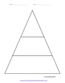
3 Level Pyramid
Three separate sections allow you to chart relationships by moving from general to specific, or vice-versa.
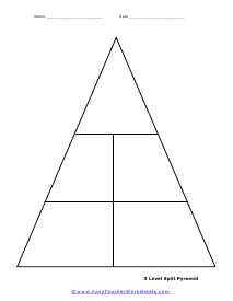
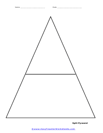
3 Level Split Pyramid
Similar to the above, but each of the two lower sections is divided in half, for five spaces in all.
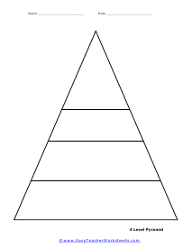
4 Level Pyramid
Four separate sections allow you to chart relationships by moving from general to specific, or vice-versa.
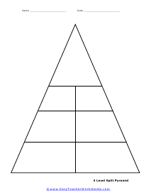
4 Level Split Pyramid
Similar to the above, but each of the three lower sections is divided in half, for seven spaces in all.
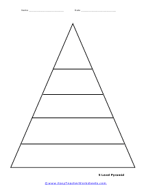
5 Level Pyramid
Five separate sections allow you to chart relationships by moving from general to specific, or vice-versa.
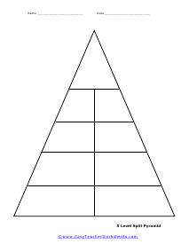
5 Level Split Pyramid
Similar to the above, but each of the four lower sections is divided in half, for nine spaces in all.
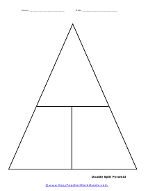
Double Split Pyramid
This template is divided both horizontally and vertically to create three separate spaces.
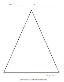
Open Pyramid
This blank template has no divisions, allowing you to create your own if and as needed to suit your style.
How to Use a Blank Pyramid Template
When the word "Pyramid Chart" comes around, everyone has some idea. All of us have seen the infamous food chain pyramid chart in school. The format of a pyramid chart has a lot of business uses.
A pyramid scheme is very convenient for business communication in an organization. It is an excellent format for displaying groupings of information, conveying research data, and describing organizational hierarchies. They can meet many business communication needs in an organization; hence it is essential to use a pyramid chart.
Data
The advantage of a pyramid chart is that the ascending form makes it easier for the reader to understand the scale without consulting. For example, in a bar chart describing the percentage distribution of expenses in an organization, the chart will display the percentages as a scale on the left. The reader will have to consult the percentages to understand the data.
In a pyramid chart, the decreasing triangle size makes it easier for the reader to understand the scale. And hence they can have a glance at the data and understand the distribution of scale within the data. The giant triangle will represent more extraordinary expenses, and smaller ones will represent lesser expenses. In this case, the scale will be in numbers. Each triangle will be a breakdown of the respective percentage of expenses.
If the pyramid chart represents data that does not have a numerical scale but a textual one, then the upper triangles will represent objects of greater importance. For example, in a pyramid chart representing the administration hierarchy in an organization, the CEO will be at the top and the respective officers under him in the lower triangles.
Categorize
Once the scale is chosen, it is time to decide how to sort the categories. When the reader views the chart, they should understand at a glance what the sorting order of the chart is. In the case of the chart representing the organization's administration hierarchy, the CEO is at the top, and others being below him will help the reader understand the sorting order. The chart is in the order of descending. The highest is at the top, and the lowers below him.
In the case of the chart representing the expenses within an organization, the reader will see that the chart is in the order of ascending expenses. The expenses increase as you move down the chart, with the giant triangle representing more expenses.
It is your choice as to how to sort the categories. Suppose you think that sorting the categories in an ascending or descending order will benefit what you are trying to convey. In that case, you should use that one as long as the chart is easy to understand and not contradictory.
Visuals
Once the data is organized correctly, it is time to make the chart aesthetic. Colors are a great way to convey information. The proper selection of colors will make it easier to understand the chart. You need to add labels to the chart to help the reader properly understand what data each part of the chart represents. Another way to make a chart visually appealing is to add icons and images to the chart. This makes it easier to understand the chart visually without doing much reading.
In the chart representing the organization's expenses, you can choose darker colors to represent more lavish spending. While in the chart representing the hierarchy of administration in an organization, you can choose colors similar to represent more important positions.
Conclusion
Formatting and designing a blank pyramid using the accurate amount of data, category, and the right visuals into a lavish-looking pyramid scheme for presentations and lectures.