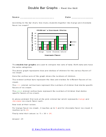
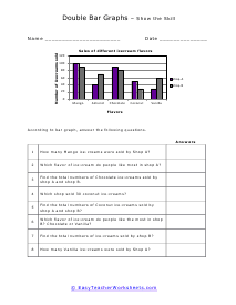
By this time we should all be familiar with a bar graph and how they help us to compare data. We will often use double bar graphs to compare two data sets at once. Imagine if you were trying gauge your schools favorite sport. To gain even more insight you were interested in the favorite sport of the students and their teachers. A double bar graph would be perfect for this. We could compare two things, the favorite sport of teachers and the favorite sport of teachers. More importantly we could also compare the relative interest between the two groups.
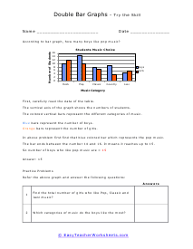
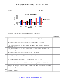
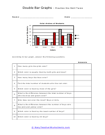
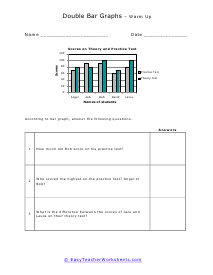
How Are Double Bar Graphs Helpful To Understand Data? Graphs are an integral part of statistics which frequently used in our daily lives. From Fortune 500 companies to financial institutions, graphs are used everywhere to represent data for easy understanding visually. There are a variety of different graphs, but the most commonly used is the line and bar graphs. Bar graphs categorically present data in the form of rectangular bars. The height of these bars is proportional to the values they represent. A form of the bar graph is the double bar graphs—these graphs display information using two bars side-by-side on the same graph. You can arrange these graphs either horizontally or vertically. There are two axes in these graphs. The horizontal or the x-axis represents the quantities being compared, and the vertical or the y-axis represents the scale, a set of numbers representing data organized into equal intervals. Here is how you can create a double bar graph; Draw in the two axes. One with items being counted (x-axis) and one with the scale that is going to be used to count (y-axis). Work out the appropriate scale. Start drawing bars to represent data. Draw both categories in different colors. These worksheets explain how to read a double bar graph to locate information and solve problems. Your students will use these activity sheets to practice comparing and interpreting information on two data sets in order to answer questions.