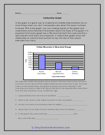
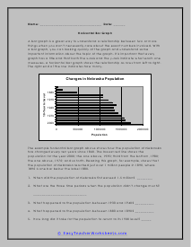
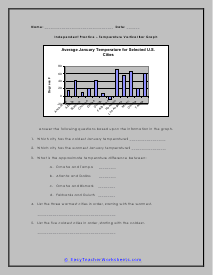
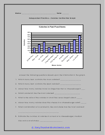
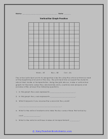
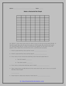
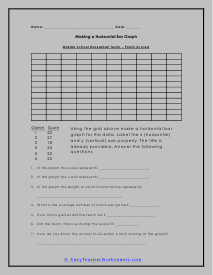
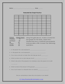
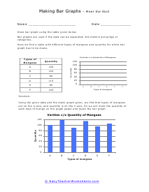
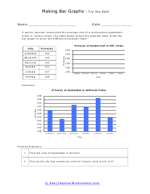
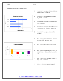
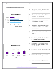
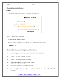
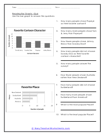
How Are Bar Graphs Used to Understand Data? What comes in your mind when you hear the word bar graphs? Colors, right? Well, drawing graphs is all colorful and fun. A bar graph, sometimes also known as the bar chart, is used when we have to make comparisons among categories. These are rectangular bars that are used when we have to show a difference in quantities among some categories, such as the amount of rainfall that occurred during different months, the average salary in different states etc. Though they can be drawn horizontally as well, bar graphs are most commonly drawn in vertical positions. Reading bar graphs is very easy. There are two axes, the x, and the y-axis, that have the numbers and values. These values represent the data of the question, and the pictures represent the highs and lows. The higher the bar, the greater the value, and the lower the bar, the lower the value.
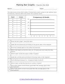
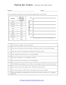
We want to bring math to life, particular data sets, we often use graphs. Bar graphs represent the value of data with a sectional line. The length of each piece displays relatively how dominant that data set is. The longer the bar, the more prominent that labeled data is. This provides us with a quick and easy way to compare data sets. It also allows us to make quickly and easier decisions based on the data. These worksheets explain how to read and create both vertical and horizontal bar graphs. Your students will use these activity sheets to practice interpreting and creating bar graphs for different data sets. Students will also compile frequency tables to turn into bar graphs for some sheets.