How do you know what type of graph to use to display data? Whenever you are wondering about the graph to display the data, you must understand that there are different types of data. The graph that you'll be needing to display your data can vary from the information you're describing. There are a line graph, bar graph, pie chart, area graph, and an X-Y Plot. Line graph and area graphs are similar to each other as both used to track alterations over different periods in one or more groups. The pie chart/graph is unlike the line graph and does not track and show the changes over time. But, if you compare the whole part of something, you need to use a pie chart/graph. While on the contrary, if you are trying to compare different groups or track the changes over time, you must go with a Bar graph. Furthermore, if you want to determine and find out the relationship between two different things, then you must go with X-Y Plot.
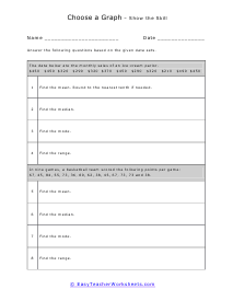
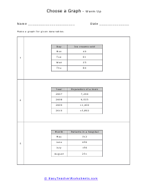
Students understand how to use and understand the data displayed on different types at this point. When students observe or are given a data set, do they know which type of graph would help them infer best? Line graphs are better used for data over short periods of time or over the same group. When we are comparing many different groups, bar graphs are helpful. When we are comparing parts of a whole system, pie graphs are best used. When we are comparing two different things, an x-y plot on a coordinate graph is the most useful graphing form. These worksheets explain how to determine what kinds of graphs can be made from a data set. Your students will use these activity sheets to graphically organize and compare data using different types of graphs.