These worksheets will teach your students how to create and interpret circle graphs (pie charts).

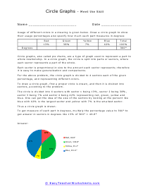
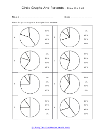
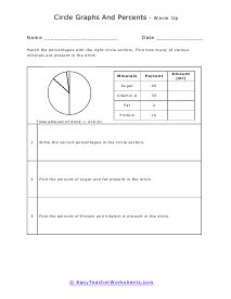
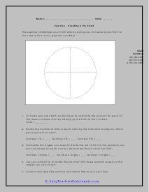
Everyone loves pizza pie! What we were not aware off was that from the first time we came across that crusty-cheesy goodness, we were actual getting a lesson in graphing. In this section of our site we will explore pie charts which, well, look like a pie or pizza pie. They are sometimes referred to as a circle graphs because, well, they are circles. We use these types of graphs to display categorical data which means we are looking at portions of a whole value. This helps us breakdown our complete population of data into smaller segments that we can better understand. This will help you better understand the whole body of data and which contribute the least or greatest amount. It helps us make the naturally progression on to percentages, fractions, and decimals. Everyone wants a big piece of the pie, we learned that the day we met pizza.

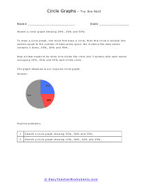
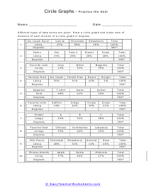
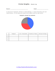
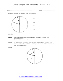
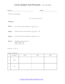
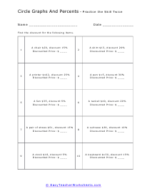
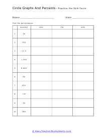
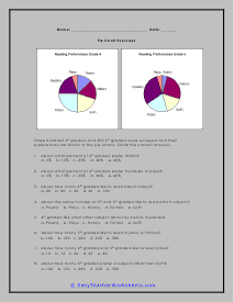
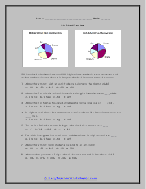
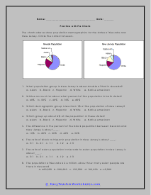
Your students will use these activity sheets to learn how to create and interpret circle graphs, also known as pie charts. Students will also practice calculating and demonstrating proper segment percentages. You not only learn how to read these graphs, but the ultimate goal is to be able to make confident decisions based on what the data is telling you. This is where you can make a career for yourself, if you are good at this skill.


Get Free Worksheets In Your Inbox!


Pie and Circle Graph Worksheets

Click the buttons to print each worksheet and answer key.

Circle Graphs Lesson

This worksheet explains how to read a pie chart. A sample problem is solved.

Print Now!

Lesson and Practice

Now all that needs to be done is to divide the circle into 3 sectors with each sector occupying 25%, 20% and 55% part of the circle.

Worksheet

Different types of data series are given. Draw a graph and make note of measure of each division; in degrees.

Practice

Sketch these values into a circle graph form.

Drill

More sketches, but they are only in fraction and percentage form. No decimals to speak of.

Warm Up

A class has 32 students. Of them 13 chose Biology, 11 chose Chemistry and rest chose Physics , Fill the table and match each subject with the right sector.

Circle Graphs and Percentages Lesson

Write the percentages into the right circle sectors.

Lesson and Practice

We review with students how to find the percentages of numbers and we vary it.

Worksheet

Find the discount for the following items. We take the last skill and grow it.

Practice

Fill in this cool chart to show that you have mastered this conversion skill.

Drill

Given data, students will label and mark the percentages in the right circle sectors with the correct percentages. Eight problems are provided.

Warm Up

Find how many of various minerals are present in the drink.

Reading Circle Graphs Lesson

Out of 300 students, about how many students voted for baseball as their favorite sport?

Lesson and Practice

If shopkeeper earns $500 in a week, how much did he make from selling nonfiction books?

Mr. Davis Worksheet

This pie chart shows how Mr. Davis distributes his monthly income. According to pie graph, answer the following questions.

Favorite Pizza Practice

Of the people who took the survey, which pizza do most people prefer?

Favorite Animal at the Zoo

Out of 50 students about how many students totally like lions and monkeys?

Cafeteria Weekly Sales

If a cafeteria owner earns $ 470 in a week, about how much does he earn from sales of pizza?

Understanding Circle Graphs Lesson and Practice

The graph represents the favorite hobby. Which type of hobby accounted for about 23% of all the hobbies?

School Subjects

How many people choose History as their favorite subject?

My Favorite Pet Survey

About what percentage of pets represents dogs?

My Favorite Vehicle

The graph represents the favorite Vehicle of people that were surveyed. Which type of vehicle accounted for about 36% of all the vehicles?

Favorite Cartoon Shows

How many people choose Ninjas as their favorite cartoon?

My Favorite Place

New Zealand is a pretty popular place.

How to Read a Pie Chart Review and Practice

When the sections of the pie chart are not equal in size you need a protractor to read a pie chart if you want details. A protractor is a device that measures angles. Once you know the angles and remember that there are 360ยบ in a circle, you can figure out what percent each angle is of the circle by dividing the measured angle by 360.

Convenience Store Weekly Sales

How much money did customers pay for bubble gum?

Creating These Charts Worksheet

Your class went on a bird watching field trip and you want to make a pie chart of the birds you saw.

Chart Practice

Your class went to the park and counted the number of people wearing each color of shirt on your list. You want to make a chart of the counts.

Skills Check

This exercise challenges your math skills by asking you to create a chart to show the ratio of some gigantic numbers!

Pie Chart Exercises Worksheet

Three hundred 4th graders and 300 5th graders were surveyed and their preferences are shown in the pie charts.

Practice

500 hundred middle school and 500 high school students were surveyed.

Population Check

The charts above show population demographics for the states of Nevada and New Jersey.

Making Pie Charts Worksheet

Your class went to the mall and counted the number of people wearing each color of shirt on your list.

Household Budget

Create a way to view a household budget and see how a family is spending their money every month.

Nevada Workforce Drill

Use your skills to illustrate the types of industries people in Nevada work in.

Nebraska Workforce Skill Check

What three areas each have less than 10% of the workforce?

Reading and Understanding Pie Charts Lesson and Practice

We can see that horse riding, chatting and playing accounts for 14% of all the hobbies.

Worksheet

Another go at favorite subjects and pets.

What Do You Like to Eat and Drink?

How many people chose burger as their favorite food?

People Love the Bus!

How many people chose bus?

Favorites Quiz

About what percent of cars represents BMW?

Out of Reach Wedges

We interpret a premade chart and analyze the data.

Literacy Rate Pie Graph

According to data that is presented, answer the following question: In which year was the literacy rate the highest?

Student Population Pie Graph

Use a compass to draw a circle. Draw the radius. Place protractor on the shape so that 90 degrees are exactly above the center.

Sale of Fruits

What is the total percentage of sale of apples and bananas?

Favorite Foods

Find out what they survey tells us about people's favorite and least favorite foods.

Your Favorite Pie

I find it very ironic that we use a PIE graph to analyze this survey.

Favorite Types of Movies

A survey was conducted in a musical auditorium at a college about student's favorite movies and the data was obtained.