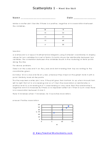
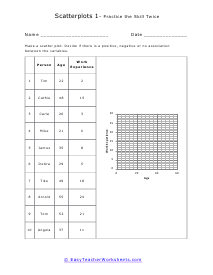
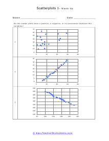
What Are Scatter Plots and Line of Best Fit? There are a variety of different ways you can visually represent data. Bar graphs, line graphs, histograms, pie charts, and scatter plots. While most students are well aware of what bar graphs, line graphs, and pie charts are, not many students are aware of what scatter plots are. So, what are they anyway? A scatter plot is a way to represent two different sets of data visually. It is plotted on a cartesian plane. These plots are similar to line graphs in many ways. They use horizontal and vertical axes to plot data points. The difference lies in the purpose of these diagrams as they are plotted to display how much one variable is affected by another. The relationship between two variables is called their correlation. When talking about scatter plots, it is essential to talk about the line of best fit. It is a line that passes through a scatter plot of data points. The line of best fit expresses the relationship between those points.
When we have two separate data sets we can see if they have a relationship by plotting their points on in this manner. When we plot these points on an XY graph, we can see if a pattern forms. If a pattern forms, a relationship exists. We can examine this relationship using a Line of Best Fit (Trend line). To create a Line of Best Fit we draw a line so that we are as close as possible to all the points. The Line of Best fit has two purposes in that it can help us understand the relationship between the two data sets, but it also allows us to right equation of the line. This equation can help us predict future values. This is used often in predictive modeling. These worksheets explain how to read and interpret scatter plots. This is an important skill that students will carry into advanced math and science courses. We really want students to be able to understand what a trend means on these plots.