The worksheets found here work on being able to read, create, and interpret graphs of all types.

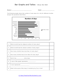
When we want to make sense of data that we or someone else has collected drawing a pictorial representation of the data really helps us better understand the data. We can spot trends or where there might be overlap. We can clearly see which value is the greatest and least. There are many different types of graphs and charts that can bring the data to life for us. When we need to track changes over time, we recommend using a line graph. When you need to compare different groups or gauge change within those groups bar graphs come in handy. When we are exploring parts of a whole system pie or circle graphs are usually the go to. When we want to find out if a relationship exists between two things the x-y plot is very helpful. We use graphs to show how things relate to each other and to help us make sense of data. It is one of those times that we are making a picture from math. If you ever peeked into the financial market you will see a slew of graphs. Understanding what those graphs mean and predicting what the graph will look like in the future are the fundamentals of any financial system. Needless to say, being able to read graphs is just as important as being able to understand what they mean.

The section on selecting graph types is a fundamental skill that is left out of most standards that we have seen, but it definitely is a core skill all kids should learn. In this section you will find just under 500 worksheets that are purely devoted to graphs and graphing. You will also find several different graphing worksheets topics in our algebra and geometry sections. Since those are much more advanced, we left them to those section. Here you will find the more fundamental sheets. We do go over how to interpret trends and make inferences based on our data.


Get Free Worksheets In Your Inbox!


Graphing Worksheet Categories

Click any of the images or words below to print out those Graphing sheets.

Bar Graphs

As the name implies these are bars that display the differences in value with images. They can have a vertical or horizontal orientation which is really based on the preference of the author.

Bar Graphs- Double Bar

This is for when we are comparing two groups of data. For example, if you were to compare the favorite ice cream flavor of two different classrooms.

Calculate the Straight-Line Graph

This is a more advanced topic where students are given a formula and must plot points on their own.

Categorizing Data and Bias

We see if your data was skewed in one direction or another by having a lack of random sampling.

Choosing Graph Types

We go through all the different ways to display your data and when to use each format.

Coordinate Plane

We show students how to find an (x, y) coordinate point.

Coordinate Graphs - Movements in a Grid

Students learn how to move between several points on a coordinate system.

Data Organizers

These are different templates you can use for the most common forms of charting data.

Frequency Tables

These show us how often certain events take place. This is very helpful and widely used with probabilities.

Graphing in Science

Students gain experience from the most simplistic use to the advances uses in science.

Graphing Mean, Median, Mode

We show you how to determine these measures with the help of a data chart.

Histograms

Another common application of data in statistics. These let you better understand the distribution of frequencies.

Labelling Quadrants

Learn how to determine the quadrant that a point resides within.

Line Graphs

A common format that is used to determine if data is connect in some way.

Line Graphs - Double/Triple Line

These can be useful for showing a comparison between multiple sets of data.

Line Plots

Another common way to display the rate of recurrence of events.

Pictographs

These associate picture with values. Each picture represents one unit. The units can also be set to be multiples.

Picture Graphs

These can have multiple orientations depending on how much data you are working with.

(Horizontal) Picture Graphs

This focuses on the upward movement of data.

Pie (Circle) Graphs

When you are comparing parts of a whole value system.

Reading Data Tables

We show students how to approach and organize data in an actionable way.

Scatter Plots

We follow a similar method to drawing a line form, but we are trying to gauge a relationship or trend within the data itself.

Stem and Leaf Plots

Another way of displaying frequency data. It gives you an alternative to a distribution table or a histogram.

Tally Charts

This is a data collection method that is helpful for keeping track of your observations.